August 14th 2023
Summary
- Divergences everywhere
- Inflation down and then…
- Employment weaker than what it seems
- Households more of the same, difficulties slowly rising the income ladder
- Housing wealth effect, some countries will suffer more than others
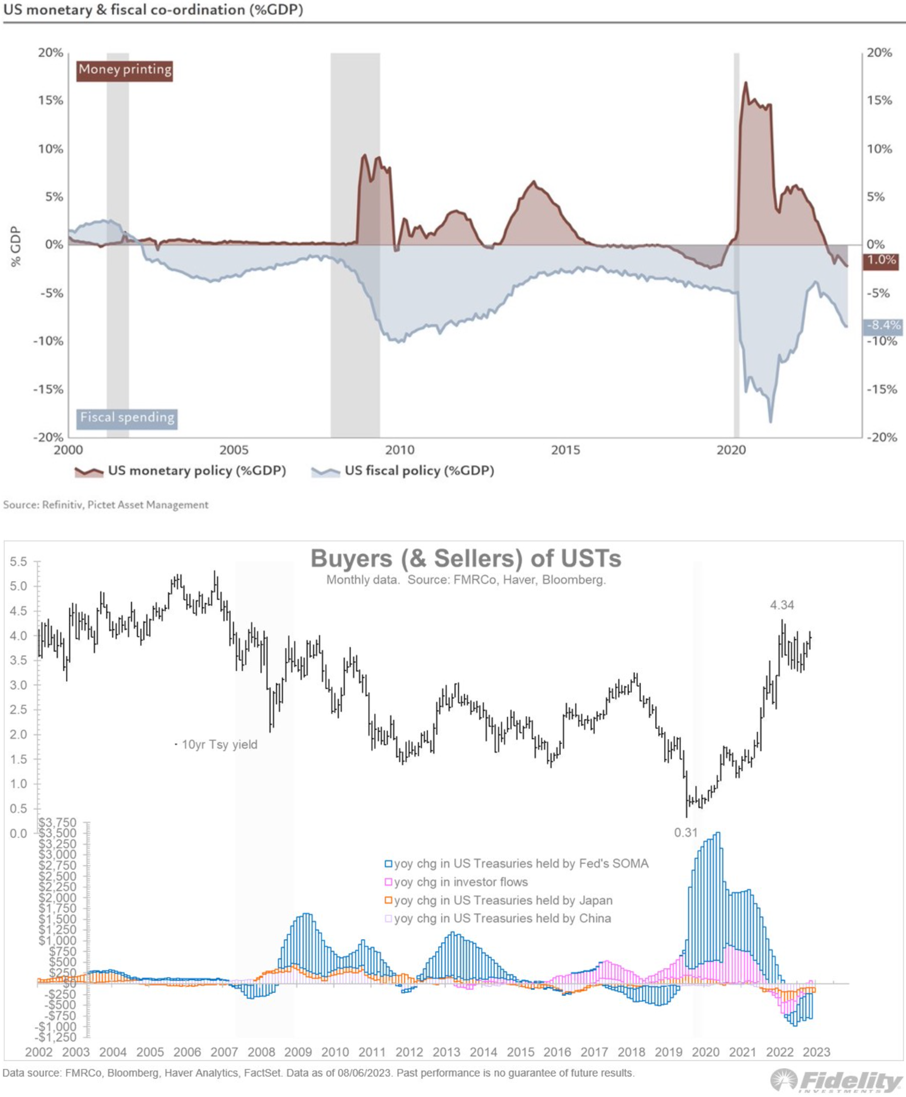
- What if bond supply is almost irrelevant?
Macro - Trifecta
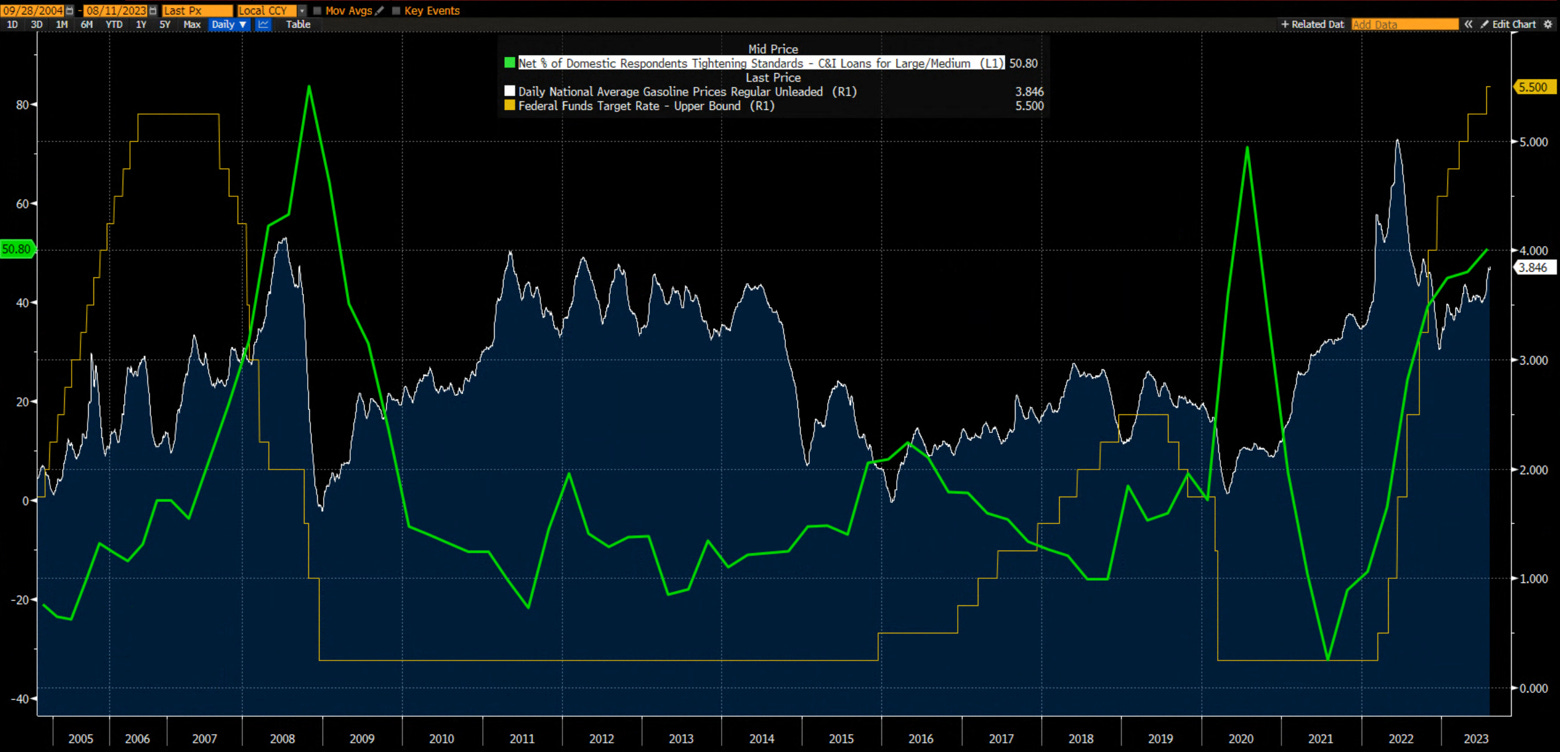
The first graph of this week is a reproduction of a graph by M. Kantrowitz.
The US economy is faced with a trifecta of headwinds:
•Rising Fed Fund rates
•Tightening lending standard
•Rising gasoline price
Macro - Yield Curve
Bear steepening is usually the last nail in the coffin of the macro expansion - and this is what we might be in the process of getting.
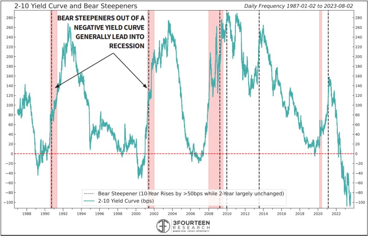
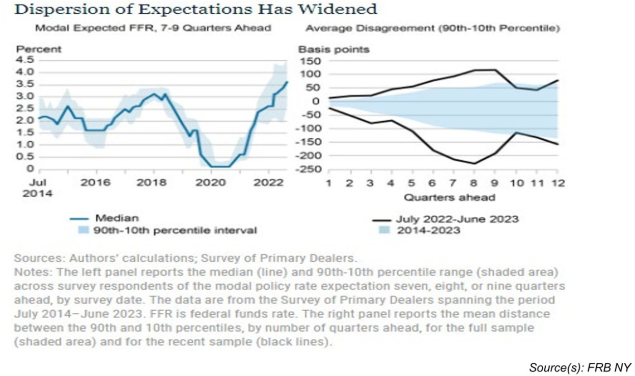
The dispersion of expectations of future Fed Fund rates has widened dramatically during this cycle making the short end of the yield curve more volatile.
Macro - Divergences
This is probably the consequence of the divergence we see in the performance of cyclicals (and the market in general) and leading indicators versus the short-term memory of market participant expecting the Fed to cut rapidly rates at the smallest signs of macro deceleration.
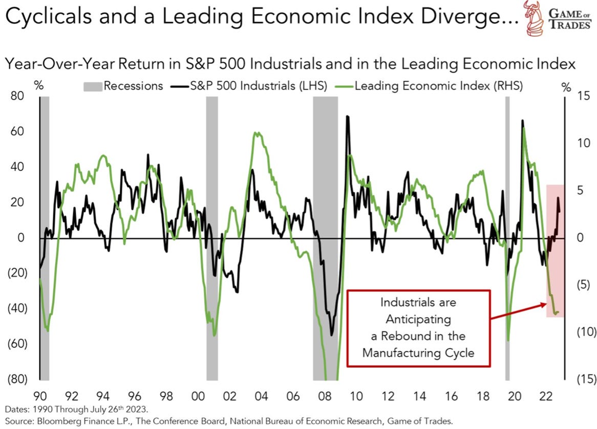
We can also see this in the resilience of the markets despite rapidly rising fed fund rates.
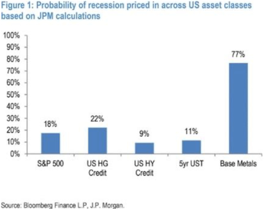
It seems that only base metals are pricing in a recession.
Macro - Inflation
Last week news about the Teamsters win in the new UPS employees pay negotiations sent shivers through the markets. Who is next?

The “déboirs” at the Panama Canal are not helping either, but…

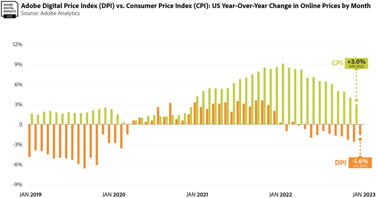
...the Adobe Digital Price index is falling. While inflation might be higher, potentially much higher in the future, a deflation scare in the next 6-12 months is still a distinct possibility.
Macro - Employment
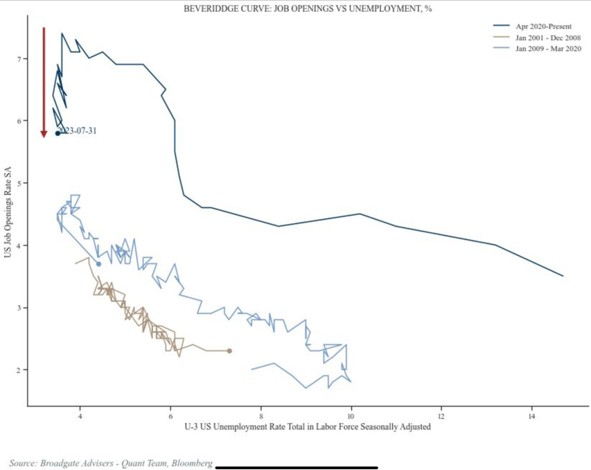
The leading indicators for the employment environment are all pointing in the same direction as we will see in the next few pages. First look at the Beveridge Curve during this cycle. …
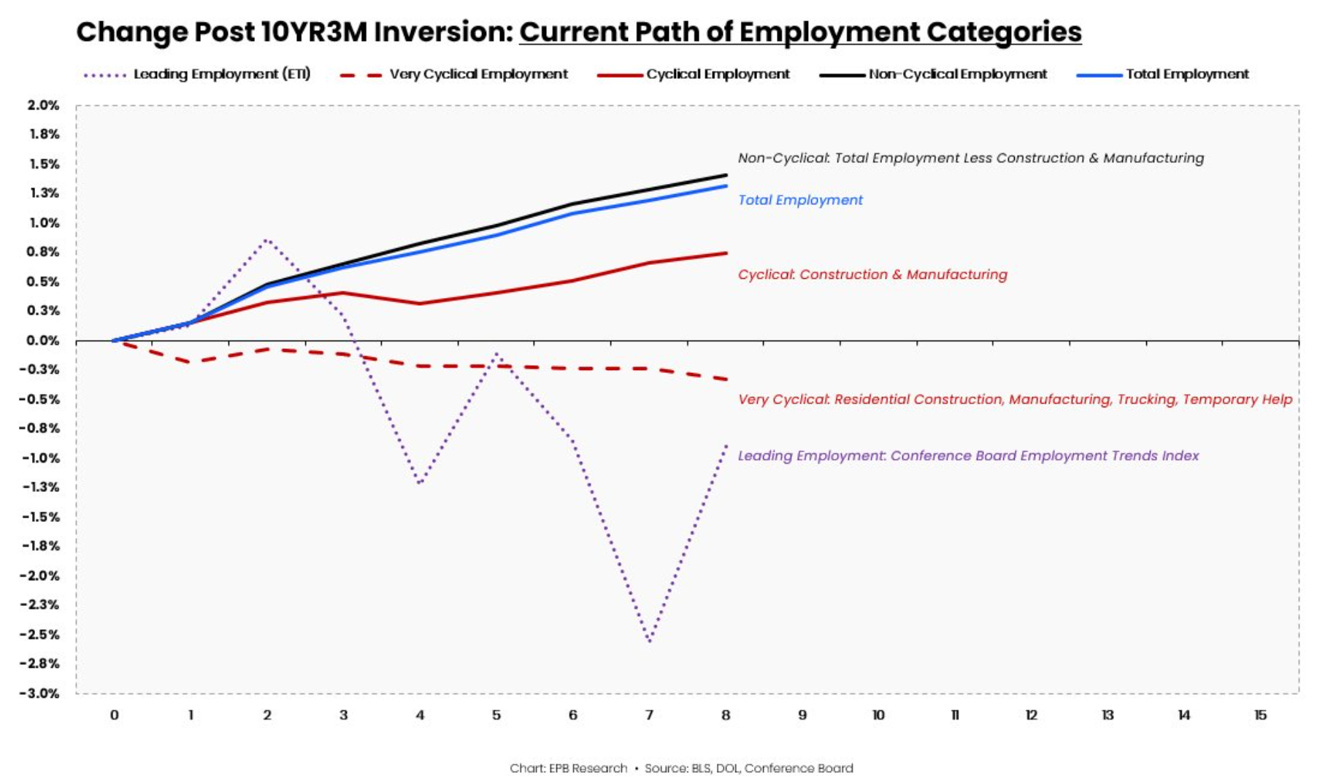
Except for the construction payroll dynamics which we explained in our last MashUp, employment is behaving as would be expected after a yield curve inversion.
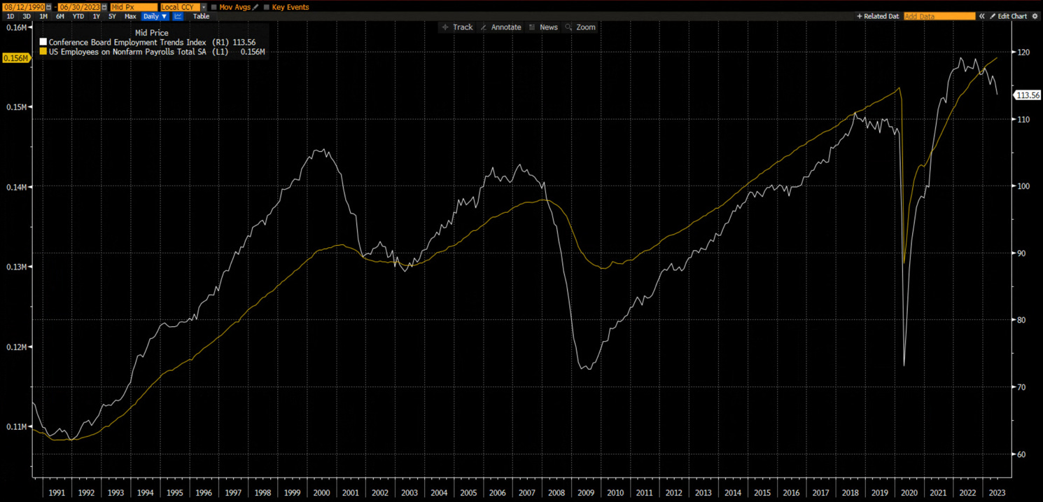
The Conference Board Employment Trend Index is diverging negatively as it has before every major employment turn.
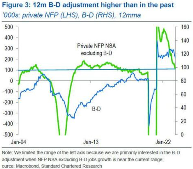
The Birth/Date adjustment have never been higher (we explained why we think this is wrong in previous Mashups).
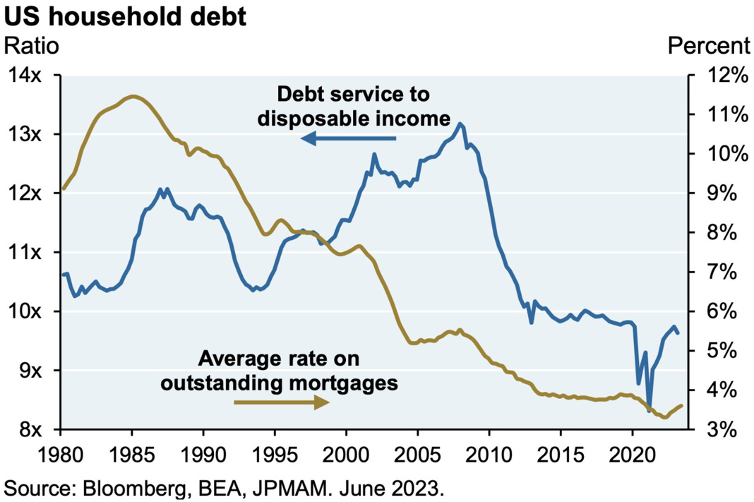
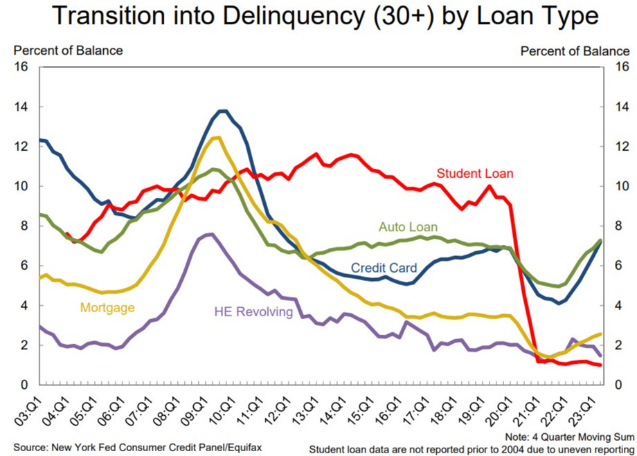
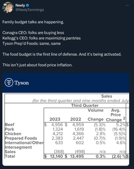
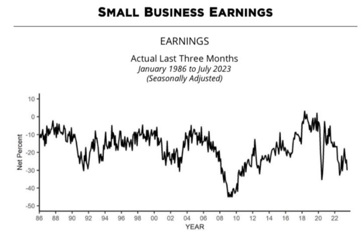
Macro - Households
We have explained at length why the expansion has been resilient to rising interest rates in the past few months (rising rates were an income tailwind for both households and corporate in aggregate). We have also noted that they are now a headwind for below median income households (the one with the highest propensity to consume), that the 50th to 75th percentiles of incomes are starting to feel the weight of higher interest rates and that lower quality corporates (small private ones) are struggling.
If your income is not sufficient to cover your consumption, borrowing is the solution, until it isn’t.
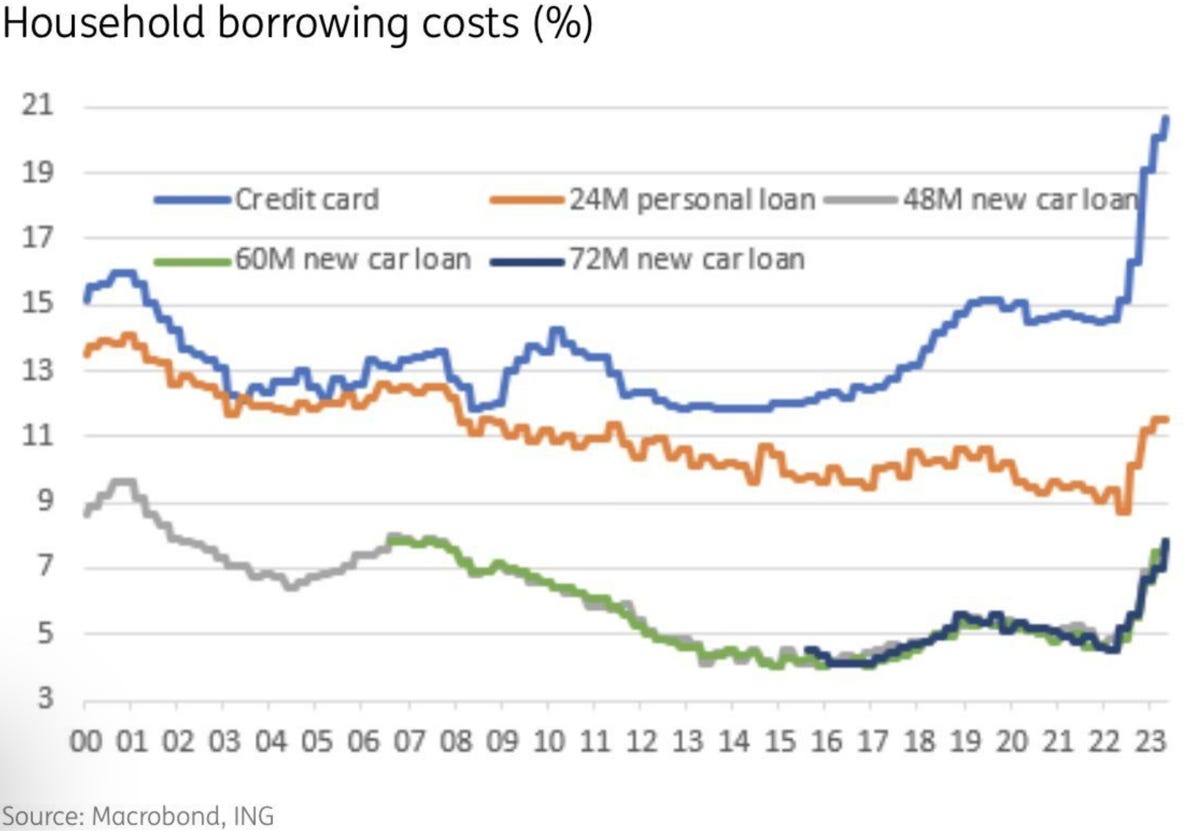
Household revolving credit is starting to decline.
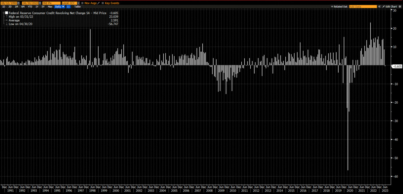
The decline is partly due to tightening bank standards and inability to qualify even with older lending standard.
Are the signs of retrenchments apparent?
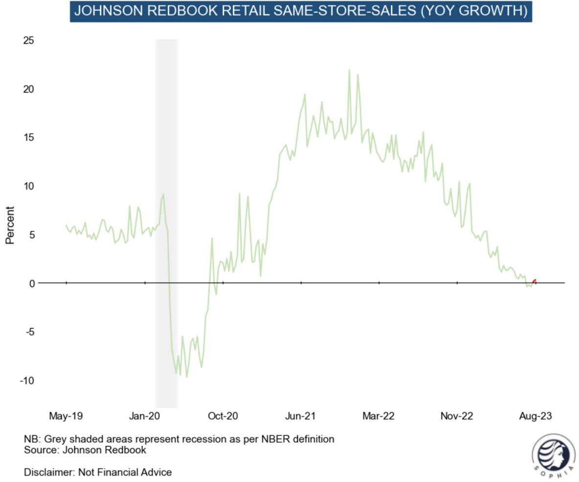
Johnson Redbook data is showing that not everything is rosy……
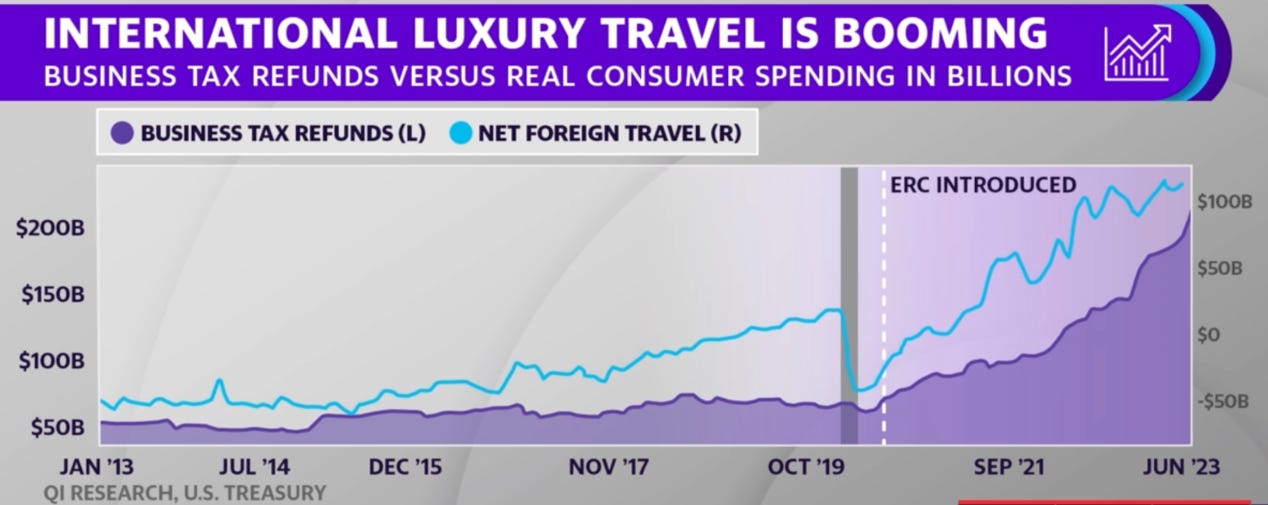
….except for those taking advantage (legally or not) of the employment retention credit boom. These are probably the same group who have no revolving personal debt and hold fixed 30 years sub 3% mortgage cohort.
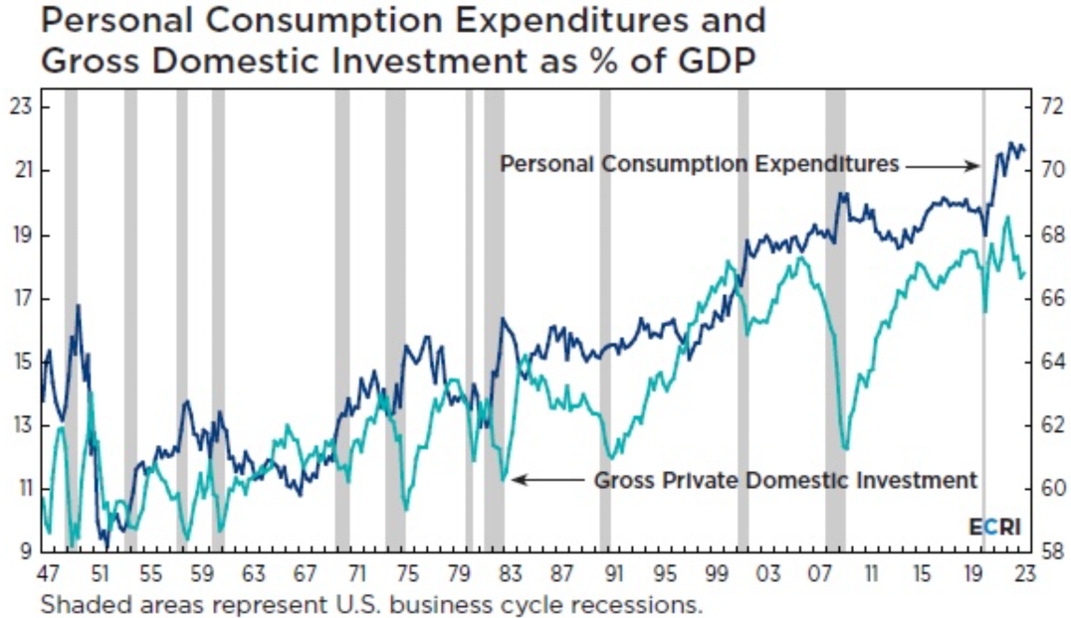
Before we move to the housing markets, we found a great graph from ECRI showing that the consumption % of GDP sometimes still rises during recession. Yes, consumption is not what tips economy into recession, it is cyclical investments and inventory corrections that do.
Macro - Housing
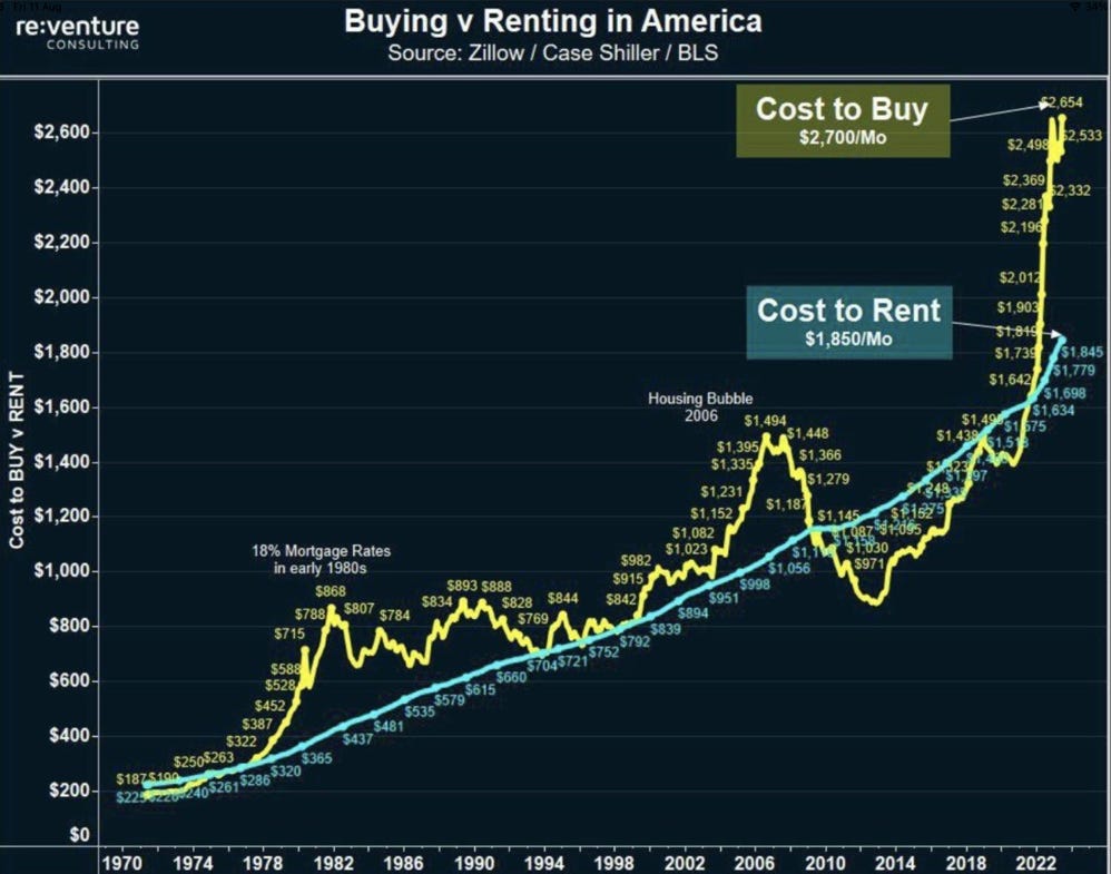
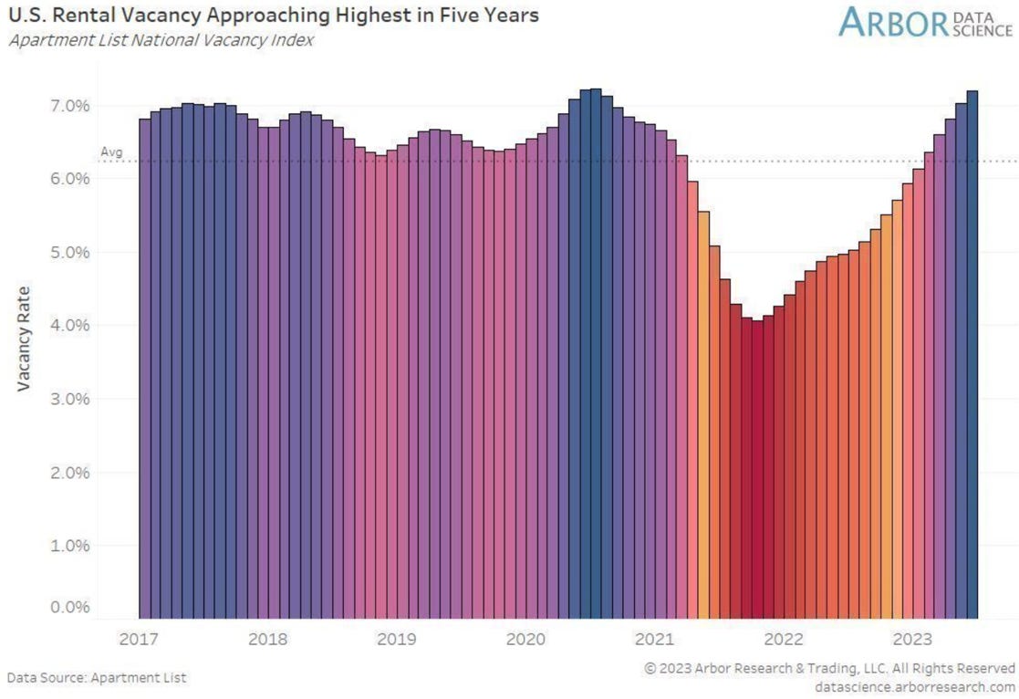
Today renting is much cheaper than buying in the US. The incoming wave of rental completions are likely to have difficulties attracting renters, this glut of property probably gets worse with any meaningful decline in house prices and/or mortgage rates.
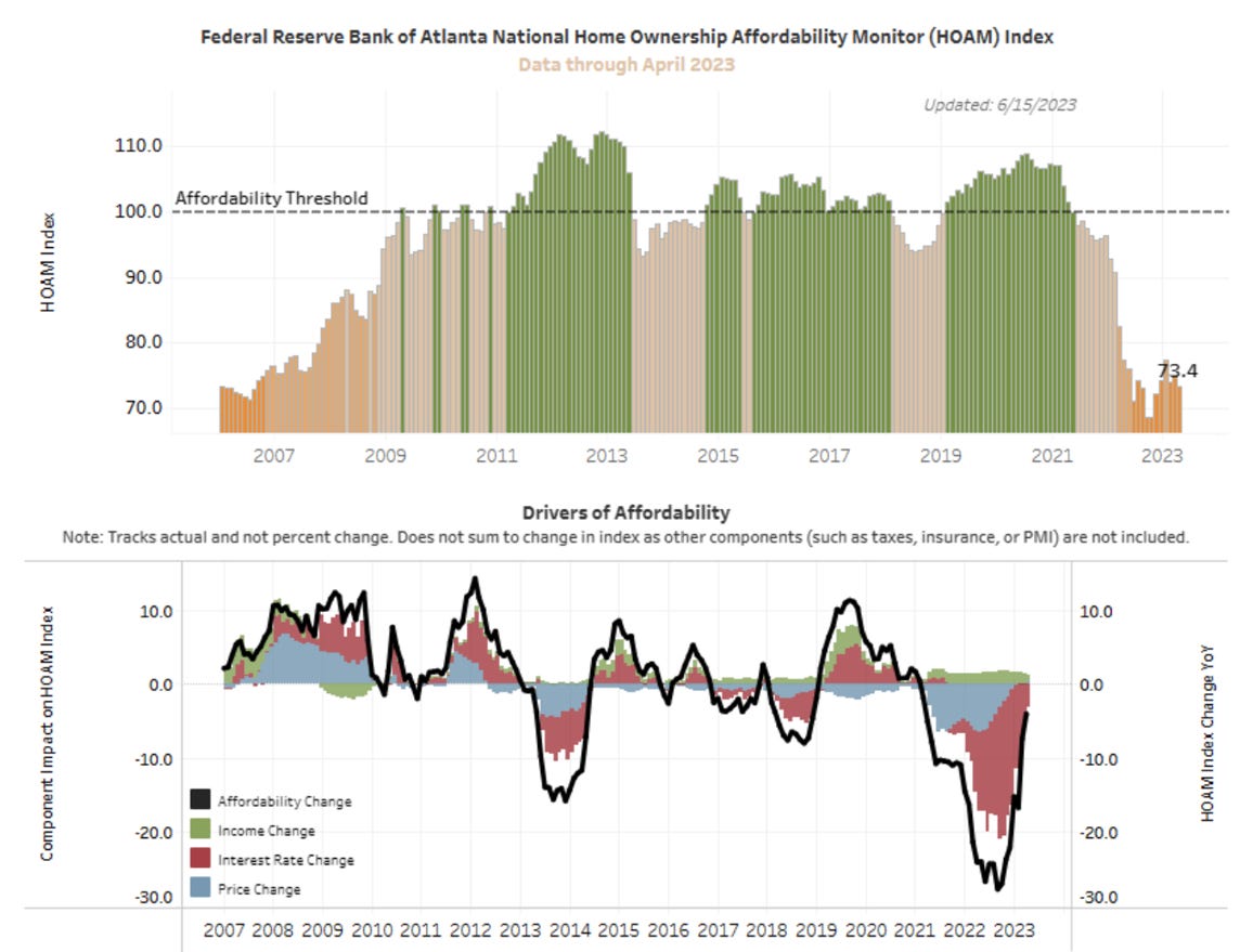
Another way to see that buying a house today is out of reach for many isby reference to the ownership affordability monitors suc has that of the Federal Reserve Bank of Atlanta.
One of the reasons that this waves of new rental property may not be absorbed promptly is that vacancies in existing property are already rising quickly.
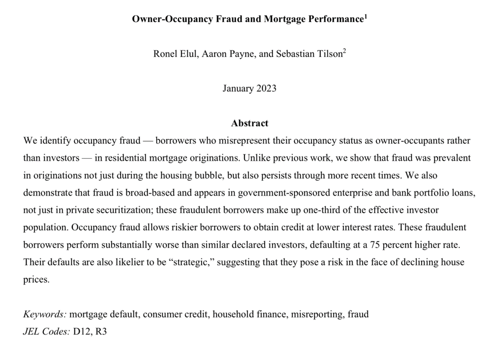
Regarding house price decline and its consequences, this paper might become a classic. Yes, there were signs!
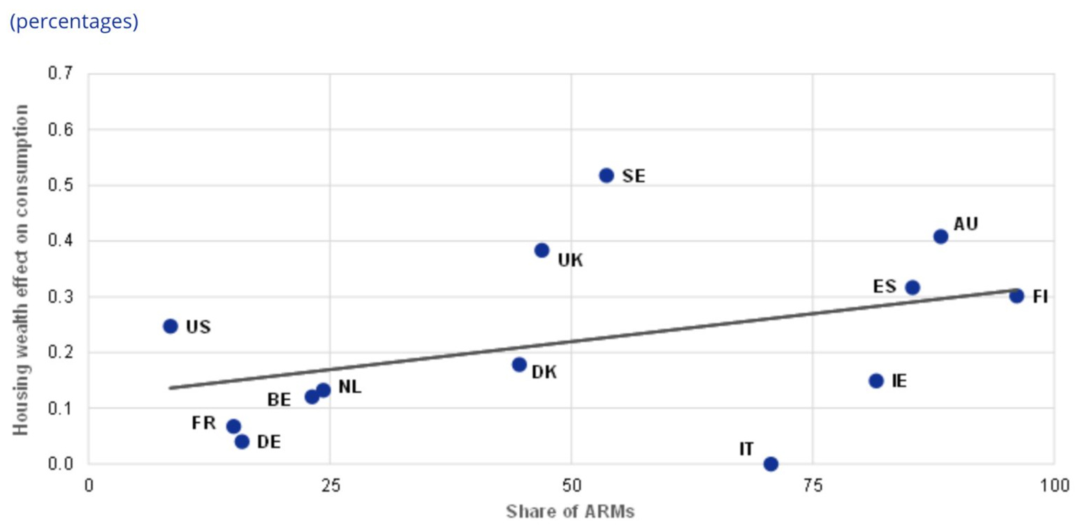
To close the real estate chapter, a look at the share of adjustable rates mortgage and the housing wealth effect on consumption. The US is far from the worse…
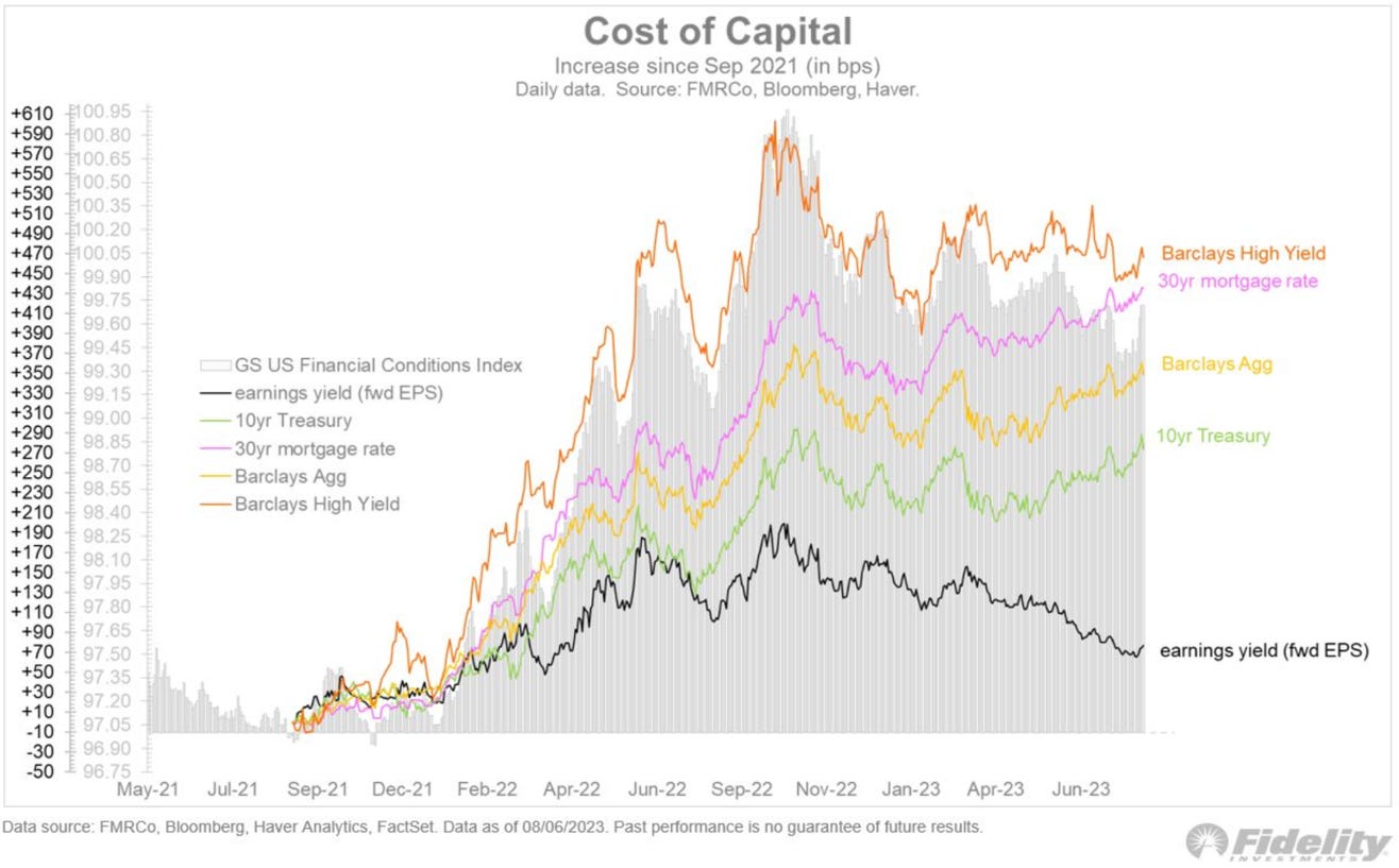
Macro - Corporations
While corporations have yet to feel the real effect of rising interest rates, they will soon have to start refinancing debt, or issuance for new investment. The increase in interest payment should be felt…
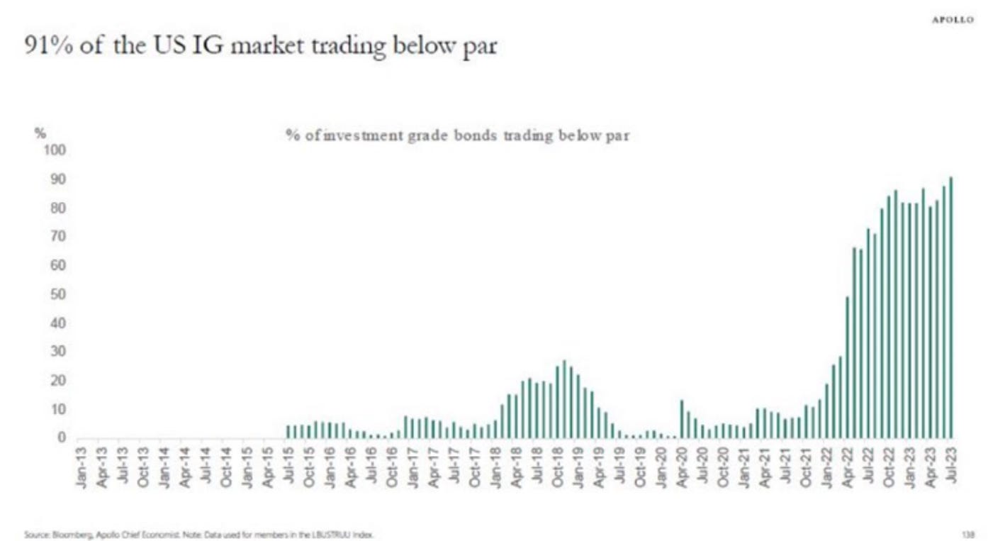
T. Slok has a good way to show that new debt will be more expensive than current debt. More than 90% of US investment grade is trading below par!
Around 25% of the Russell 3000 members are generating less operating income than the cost of servicing interest on their debts!
Falling earnings (if this happen) should have a disastrous effect.
Macro - Outside of the US
Some graphs on Europe now before we move on to China. The El Niño effect usually implies a colder winter in Europe. According to the always well-Informed A. Stahel, less than 20% of last years European energy savings came from “behavioral change”. A cold winter with still limited US LNG export and could have nasty consequences.
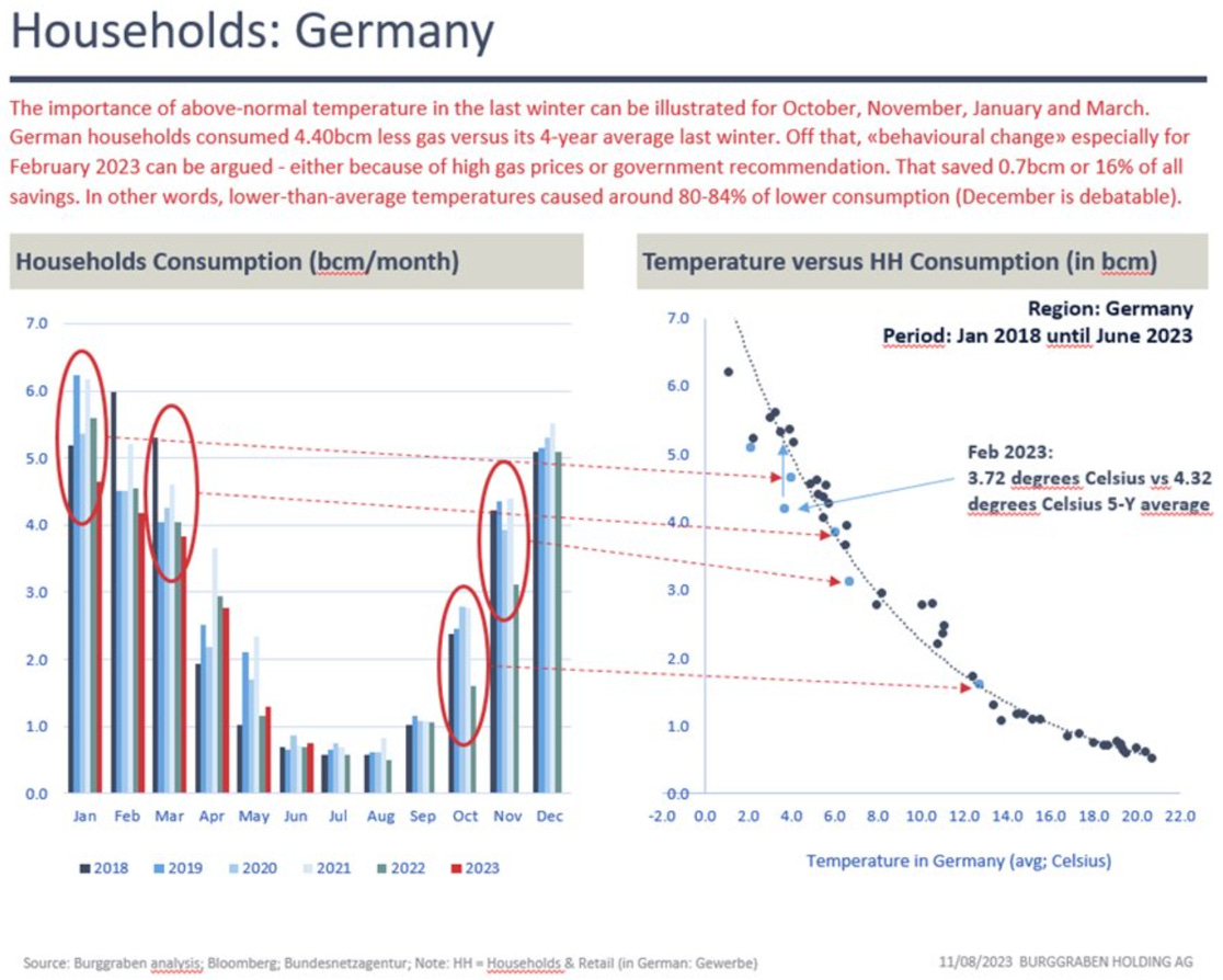
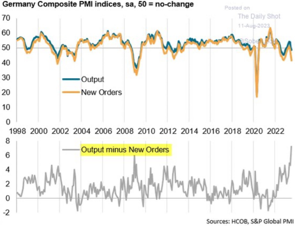
And it’s not that Germany is in best shape right now……
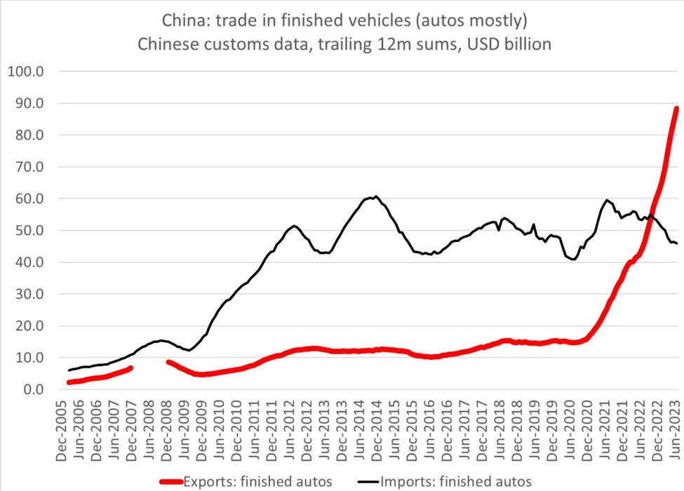
The boom of Chinese car exports will be another headwind for the old continent.
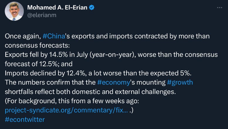
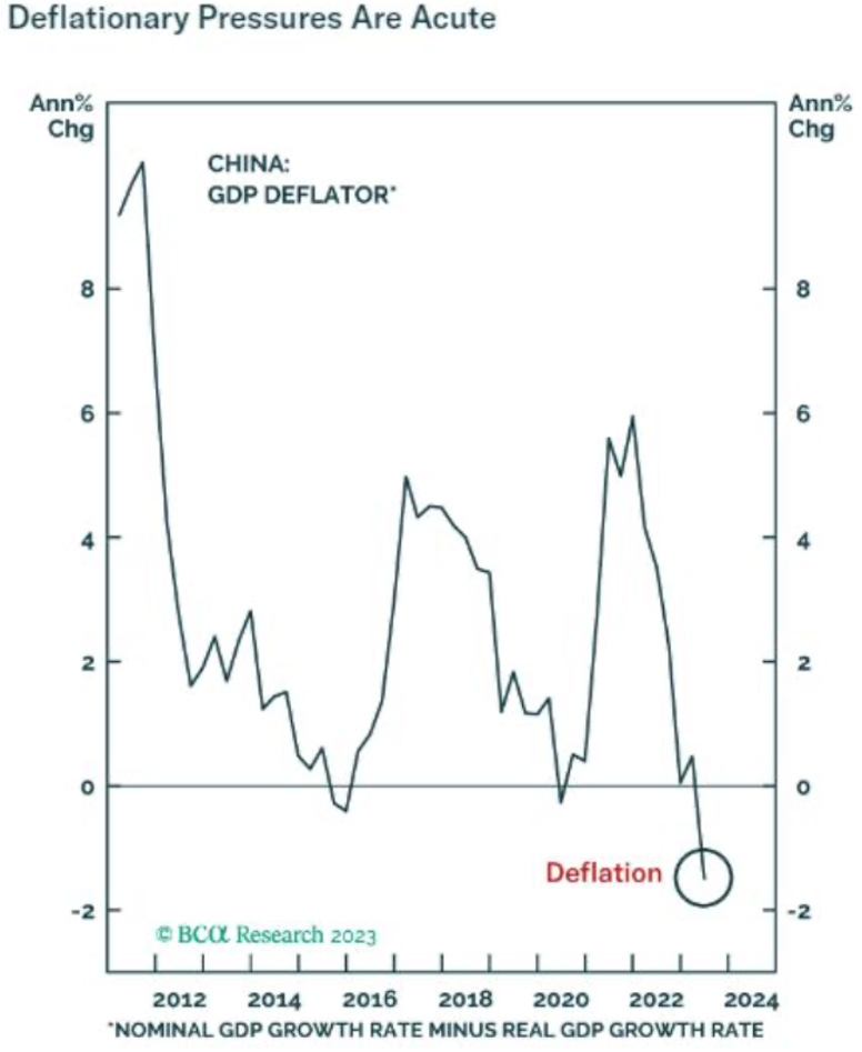
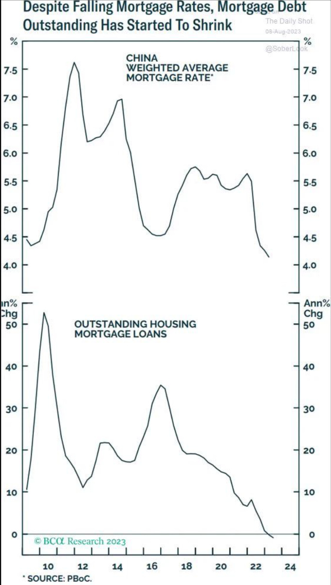
All is not rosy in China. After almost 2 decades of an infrastructure and housing debt financed binge, things are looking though. The shadow cold war between the US and China is not helping either.
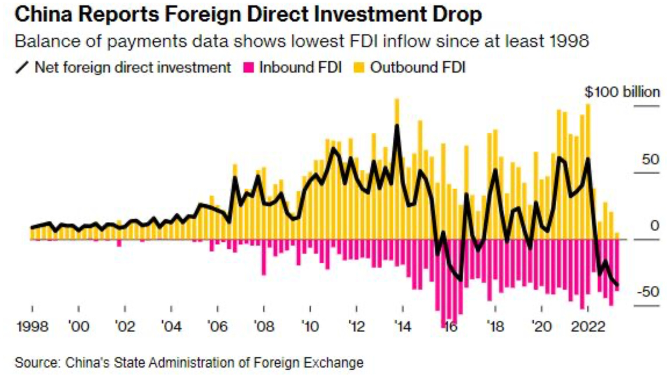
Things look rather bleak…
Markets - Sentiment
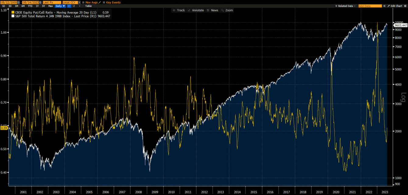
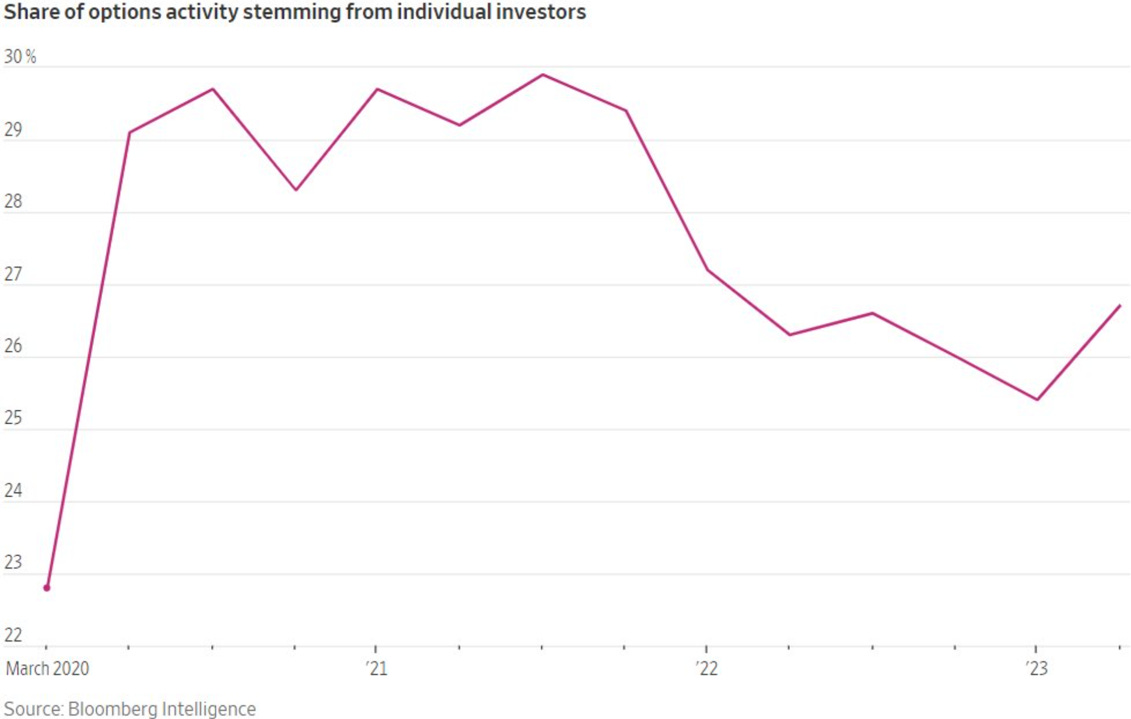
Sentiment remains bullish. The CBOE Equity put/call-ratio has now moved higher after having reached “exuberant” levels. It has been historically (except in 2021) a headwind for the markets.
Given the explosion of 0dte options volume and a return of individual investors in the option market since the start of the year, a repetition of 2021 can not be ruled out… but this seems a low probability scenario.
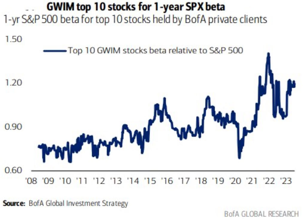
Individual investors appetite for risk can also be seen in the beta of the top 10 stocks held by BofA private clients.
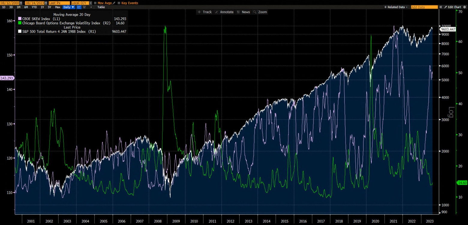
We are also seeing a large divergence between implied volatility and the CBOE Skew Index. Historically, high Skew and low VIX have resulted in falling markets.
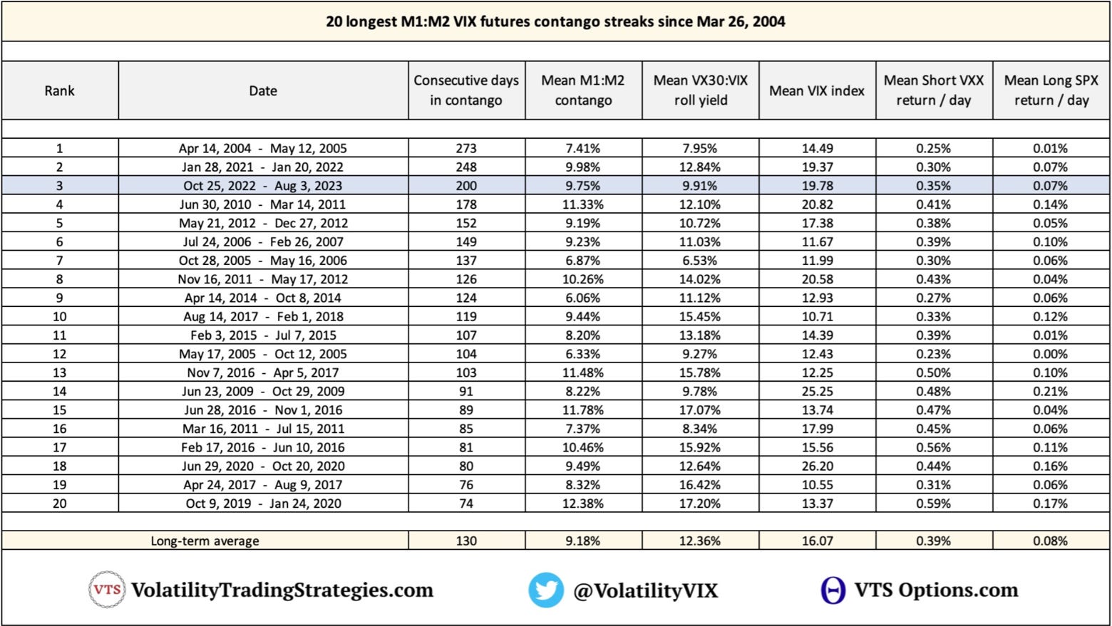
….and implied volatility has been low and with an historically long M1:M2 contango streak…
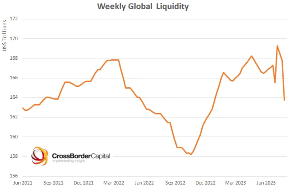
Markets - Liquidity
Cross Border Capital weekly global liquidity index has turned down abruptly in the past few weeks.
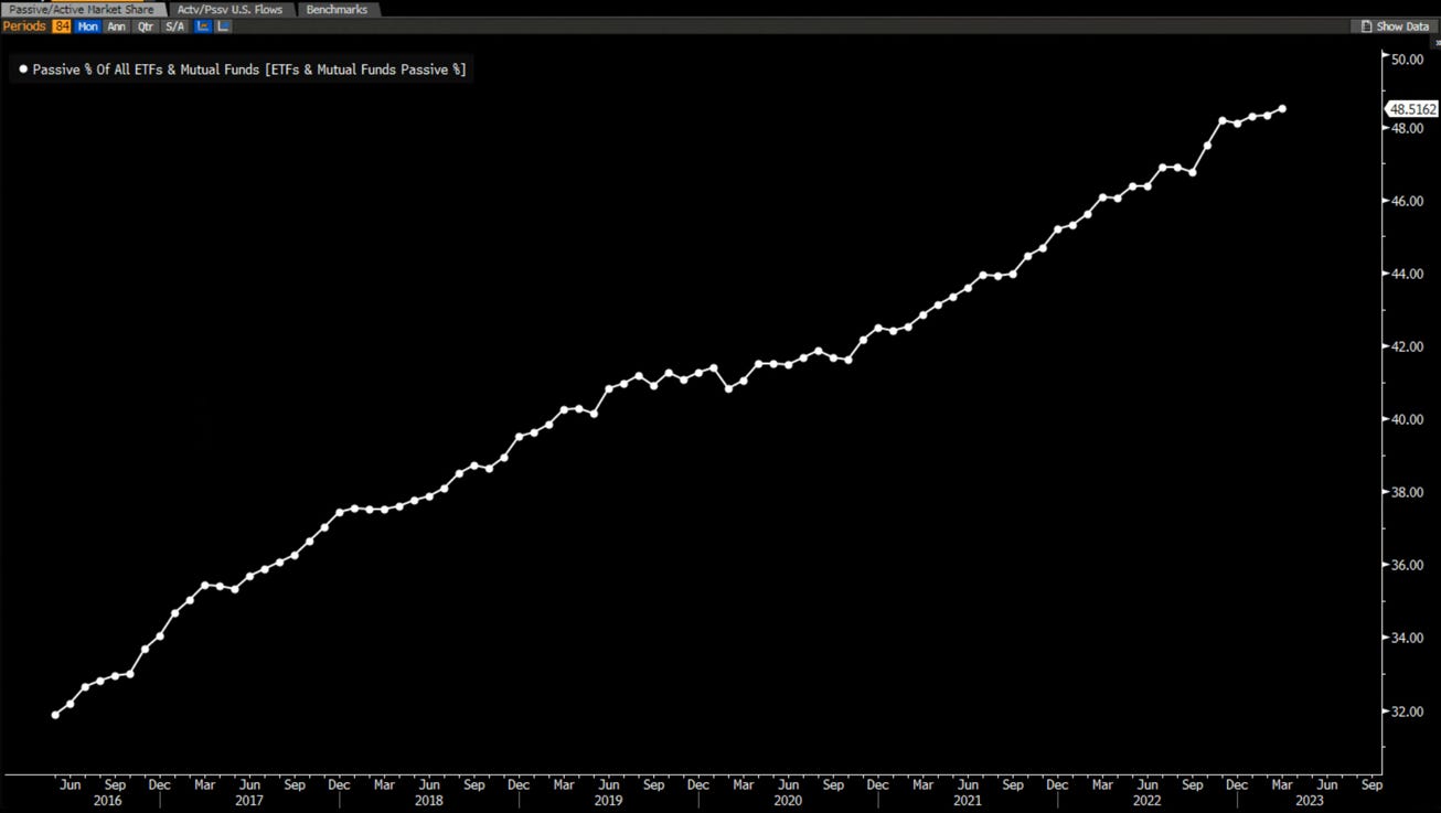
Another data point on our “passive flows are distorting the markets” mantra…
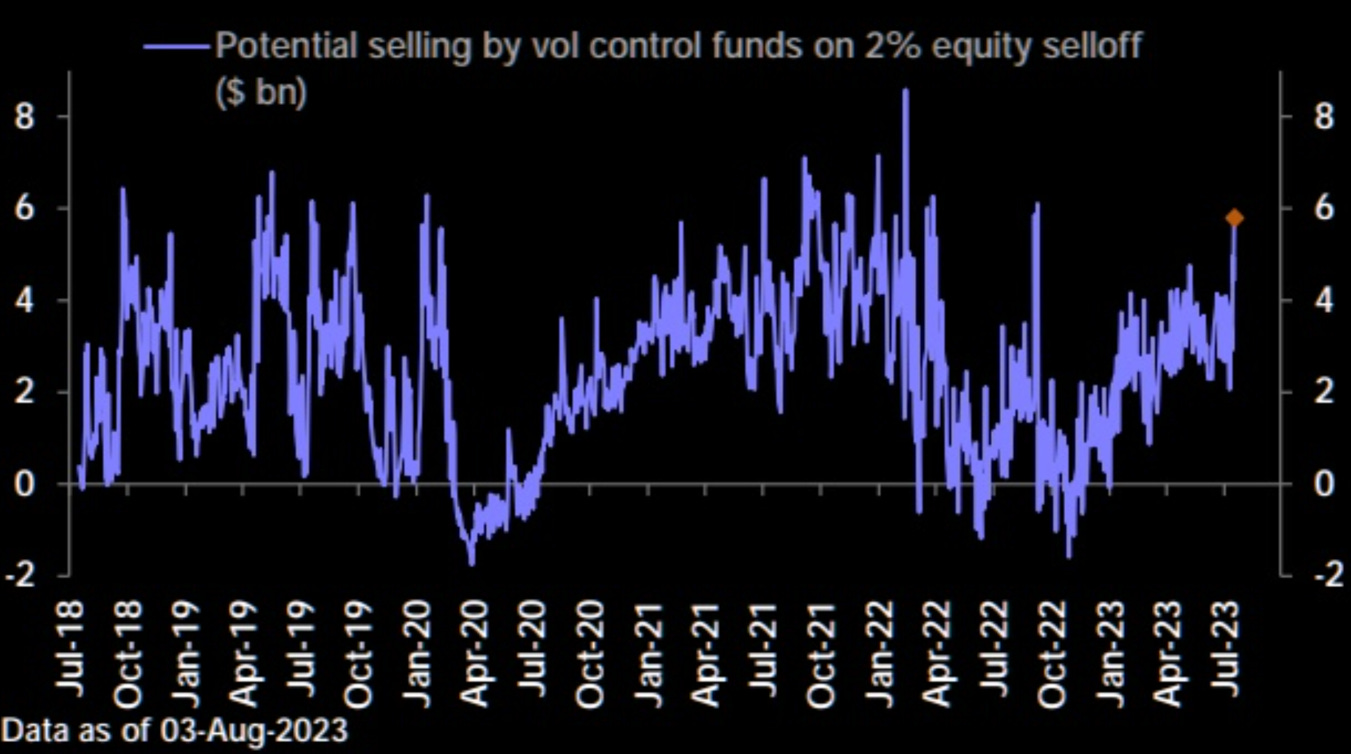
A nice graph on the impact of vol control funds by Deutsche Bank.
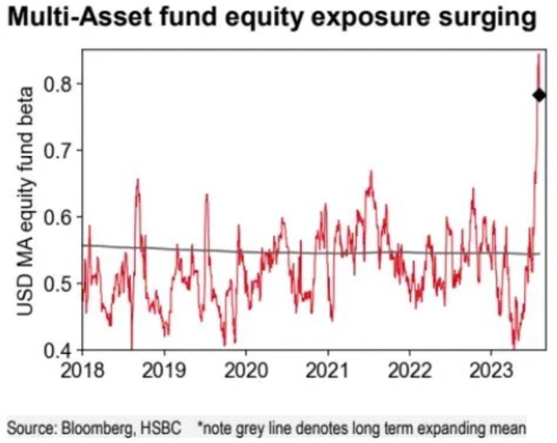
….and on the exploding exposure of multi asset funds to equity.
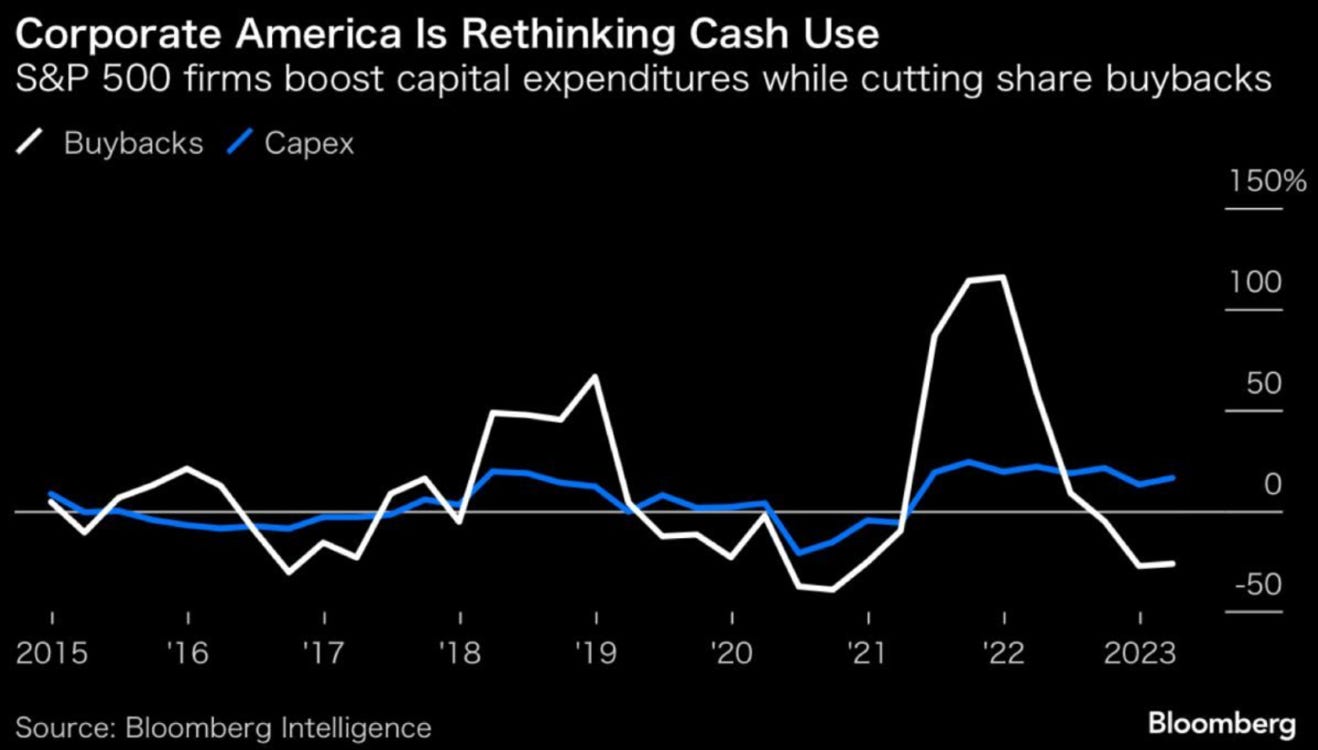
To conclude our liquidity section, another data point confirming what we have been saying in some of our recent MashUps, Buybacks won’t support the markets going forward, as much as they have in the past.
Markets - Valuation
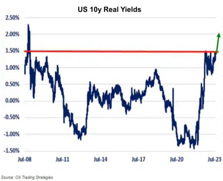
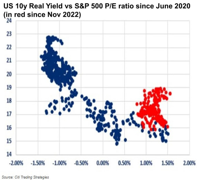
Some valuation graphs now. Let’s start with the breakdown of the relationship between real yield and the forward PE ratio.
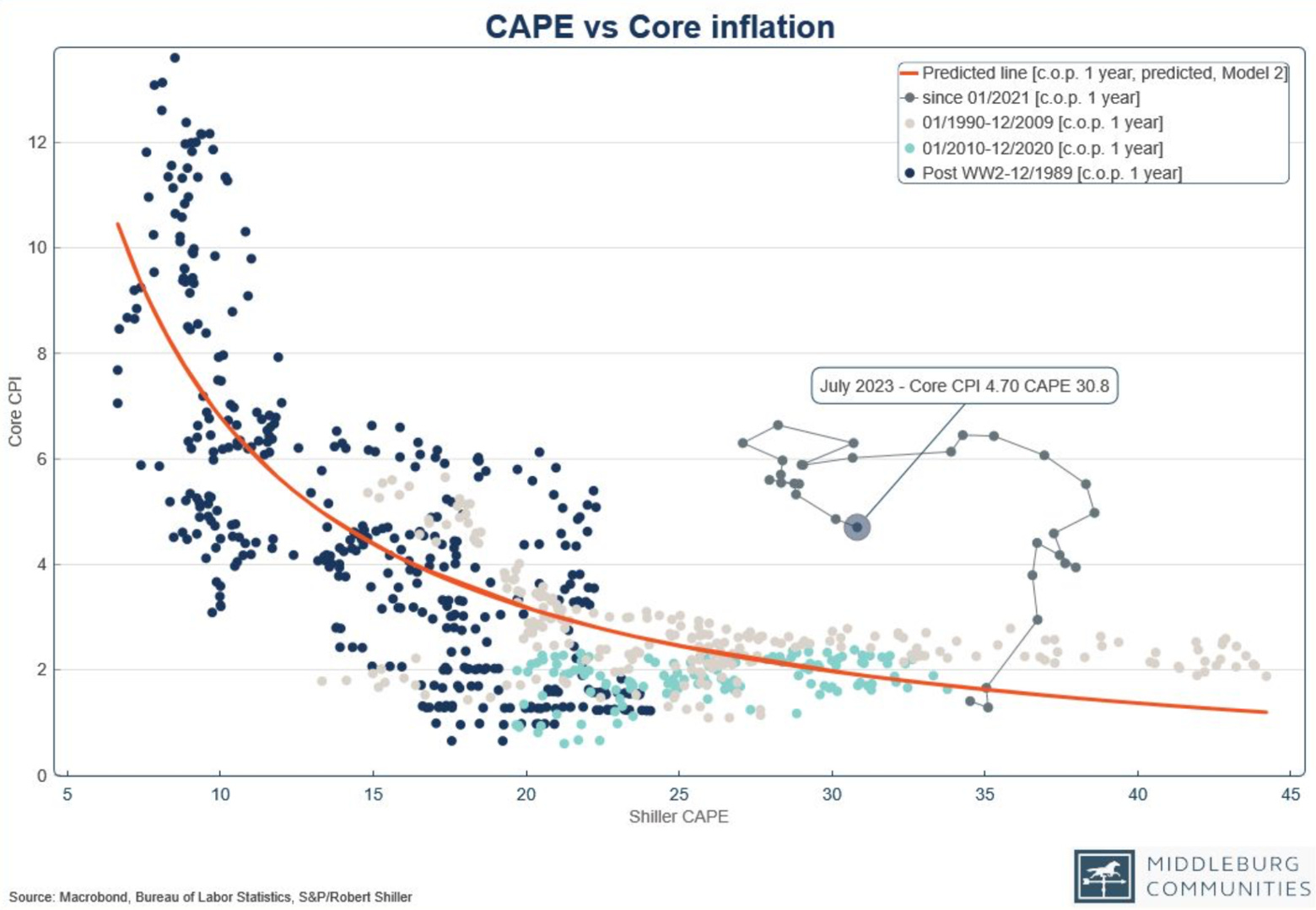
There is a similar breakdown in the relationship between Cyclically-Adjusted PE ratio and core inflation…
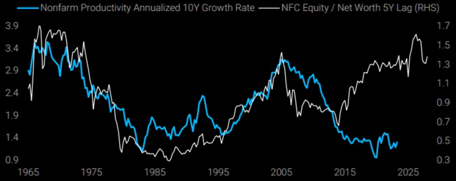
There is also a breakdown between equity to net worth (equity too high) and nonfarm productivity…
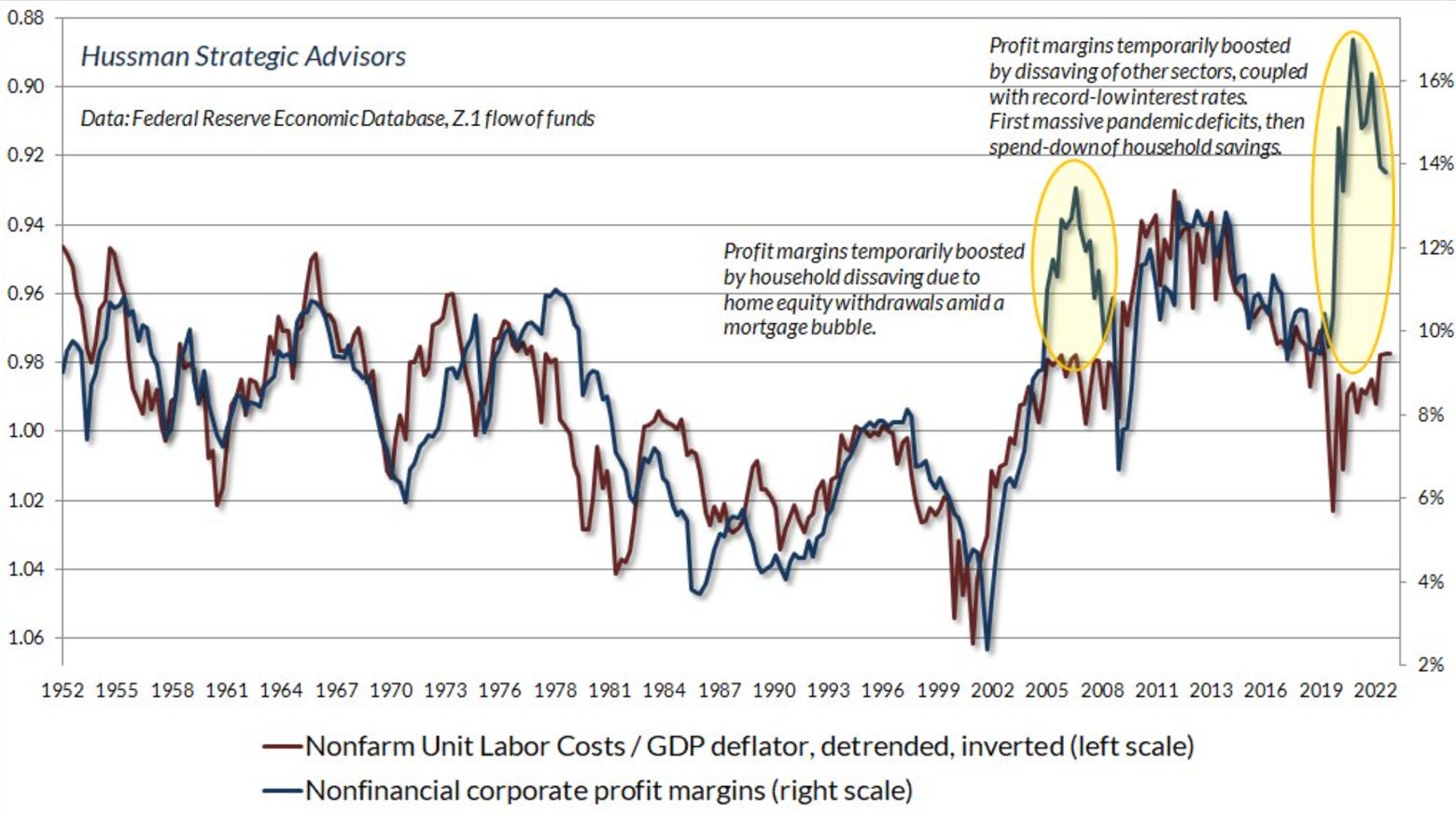
...and between profit margin and the unit labor cost to GDP deflator ratio
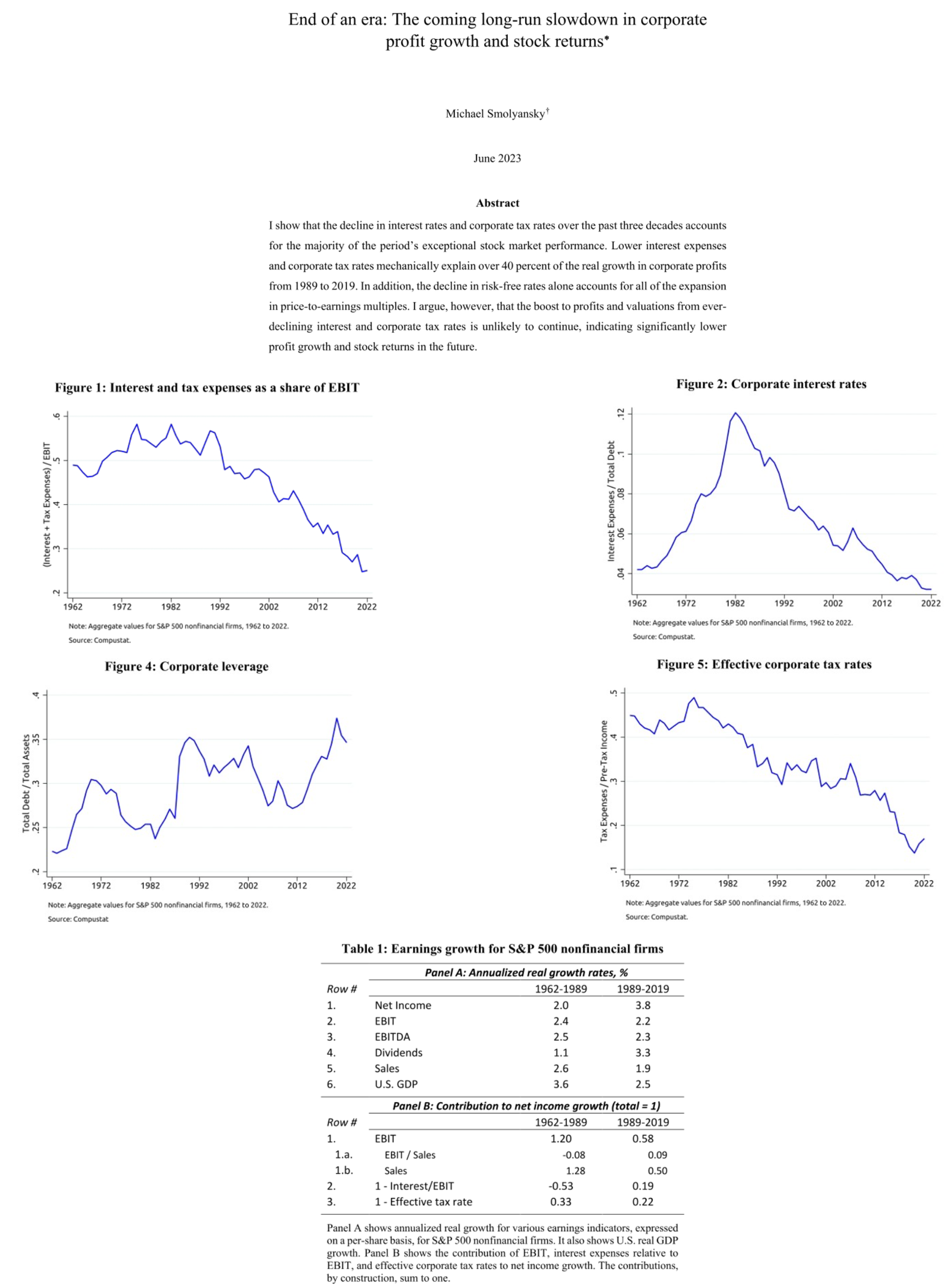
Regarding future earnings growth and forward stock returns we recommend the following paper from Michael Smolyansky.
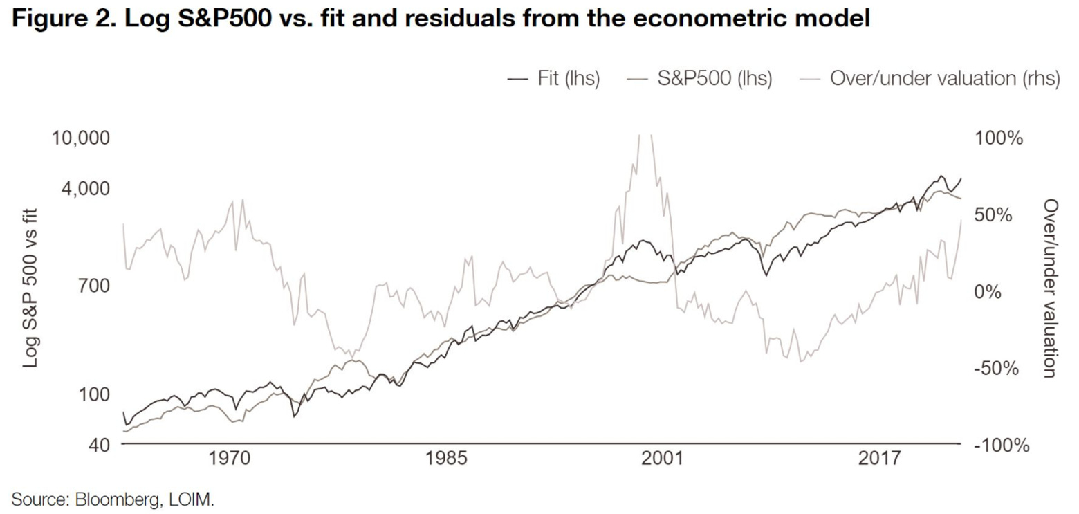
LOIM propose a model to evaluate the S&P 500. It is basically a regression of the S&P 500 on profit and 10 years rates.
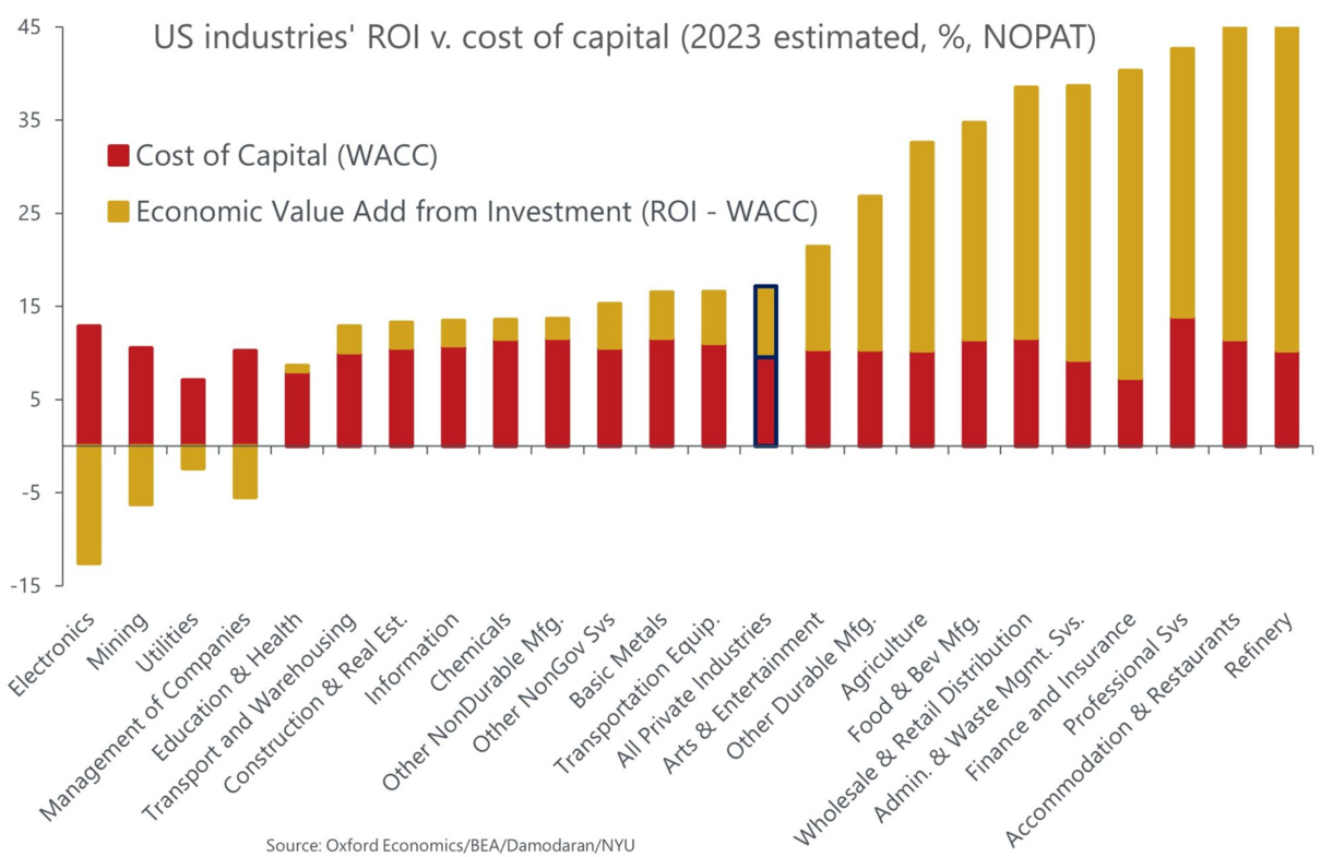
Before we look at some country/sector specific metrics, we found this great graph from Oxford Economics on the ROI vs. cost of capital of some industries. It could help you limit your hunting ground…
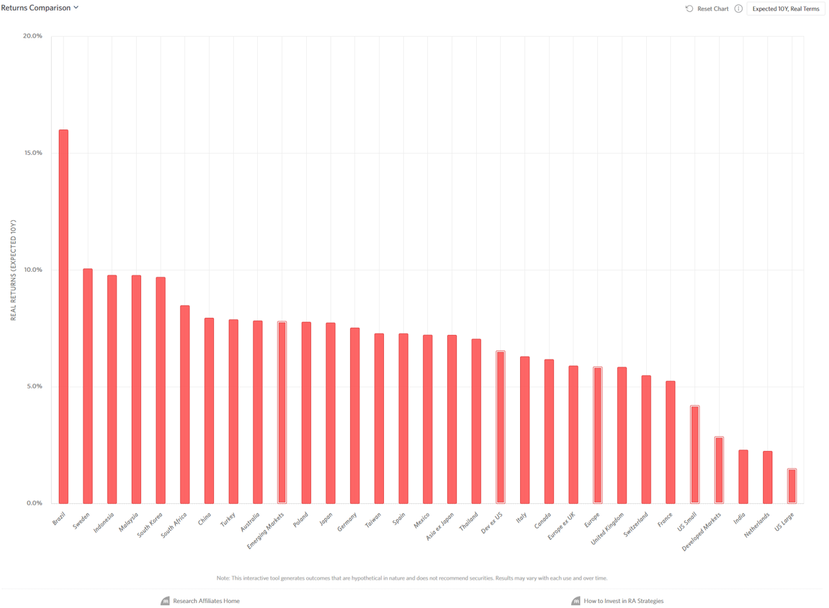
Which markets will have the best 10 years real forward total return in USD according to Research Affiliates.
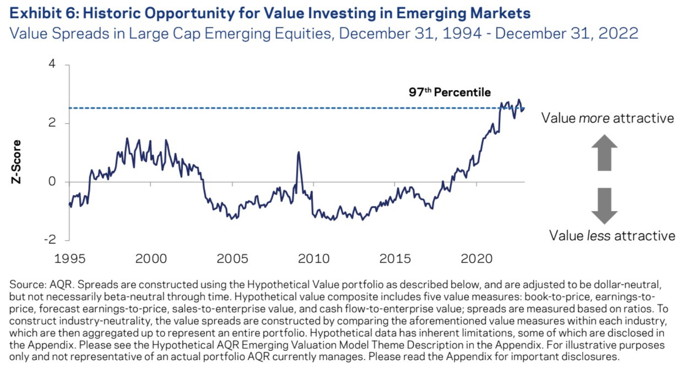
We can not put a graph of RA without putting one of AQR on the same page…
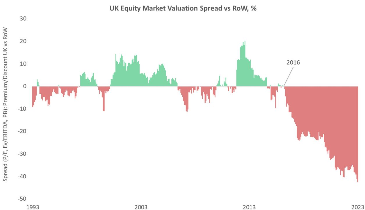
There is some great value lying around in the UK markets (especially if you are ready to pick smaller companies). If the GBP were to decline against the USD one could start to be aggressive (or not?).
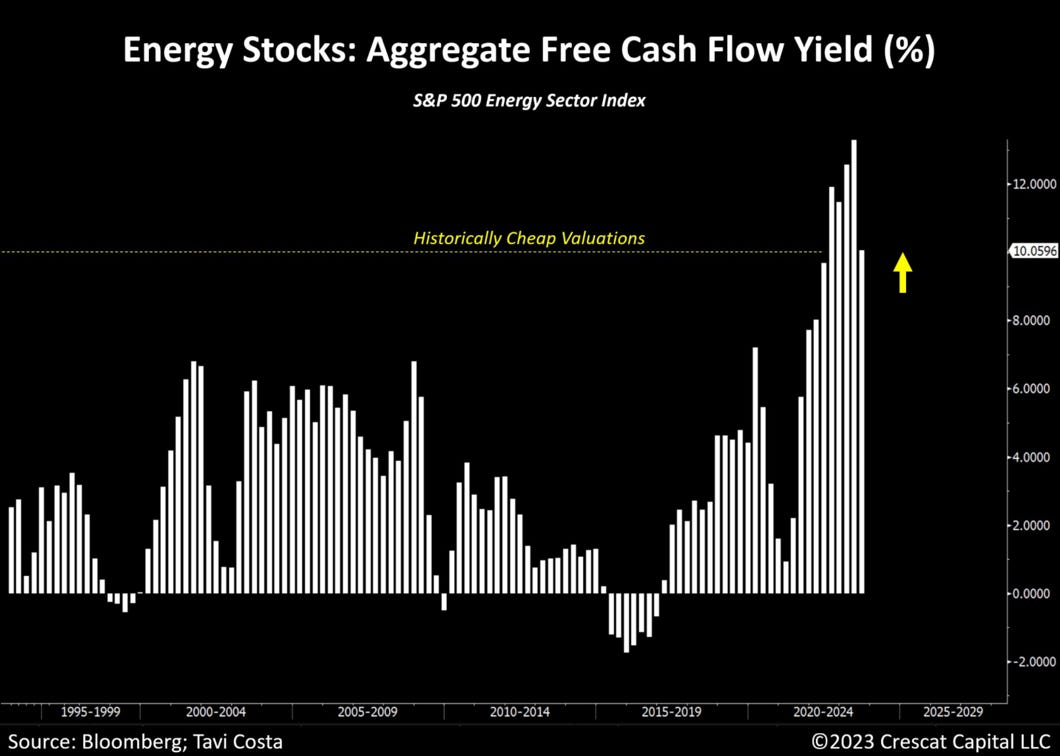
And yes, we repeat that a cheap essential sector starved of capital is going to print money….
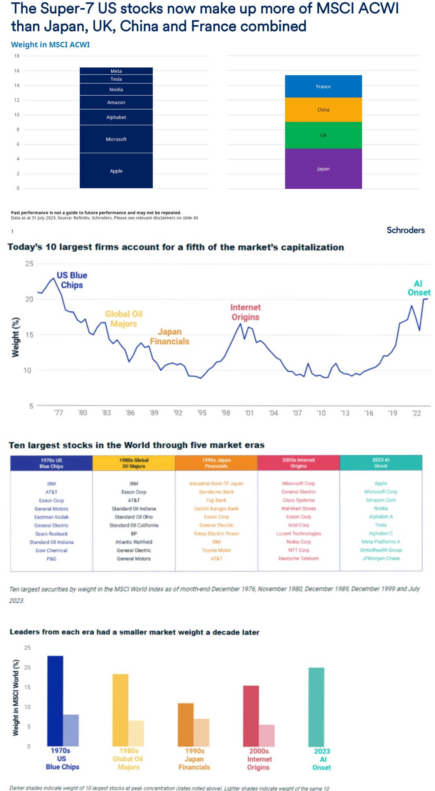
Why, the biggest stocks have historically (except during the past 10 years) not been good investments…
Markets - Technicals
For D. Sornette fans, some instability bruising…
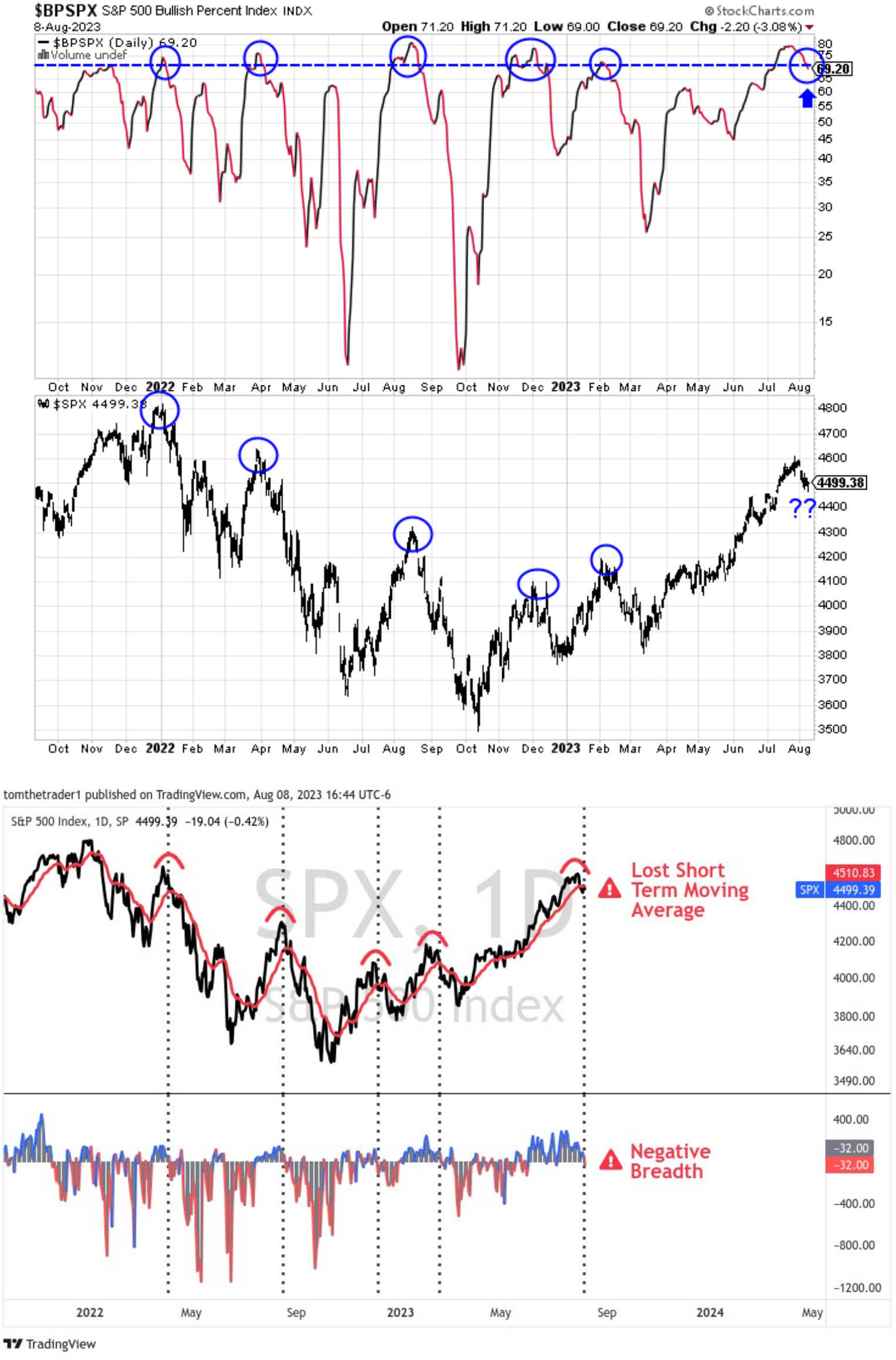
Some new breadth divergence warnings…
Markets - Fixed incomes
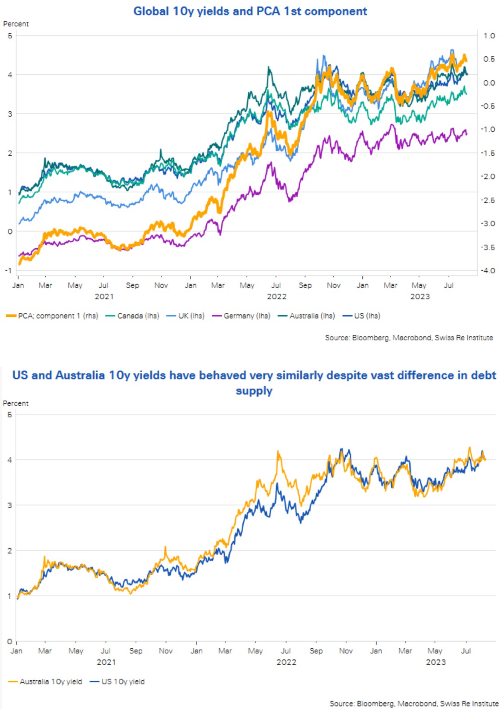
There are lots of discussions about the rapidly increasing of longer duration Treasuries and how they are going to push rates higher. Patrick Saner had a masterful way to demonstrate that this might not be the case.
First let’s show some graphs “”bear use”.
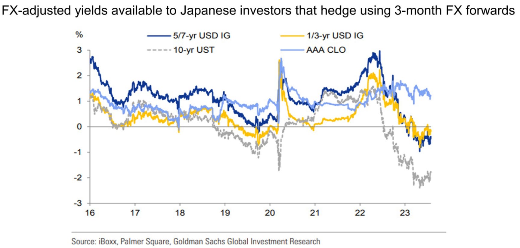
Patrick Saner shows that rates might rise because what he calls the “global low yield anchor”. JGBs have been loosened by the recent BOJ decision but not because of…
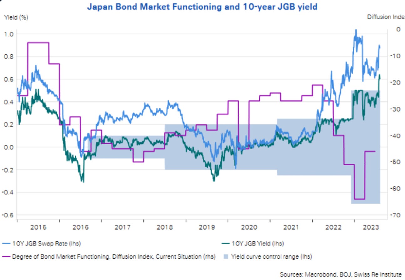
Issuance… Indeed, according to his work, a common factor explains 96% of the variance across the major government bond markers. So, as he puts it:
“10y yield across countries appear mostly driven by a common factor and not idiosyncratic supply points, inflation and policy stances,…”
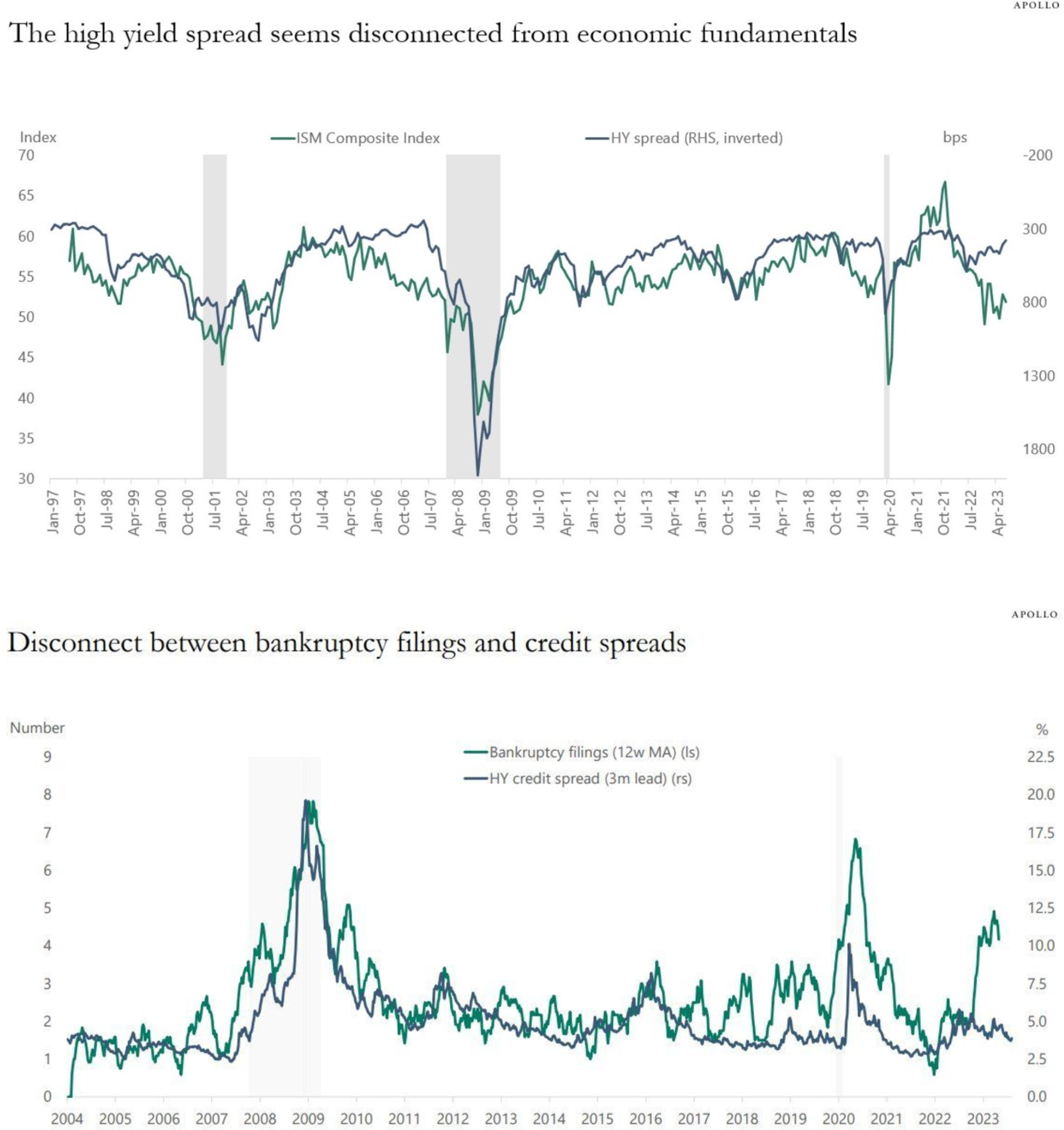
The high yield markets seems to be overvalued when looking at the macro and default dynamic.
Other
On the things future generations will scratch their head about...
And when democracy wins!